

Project Background
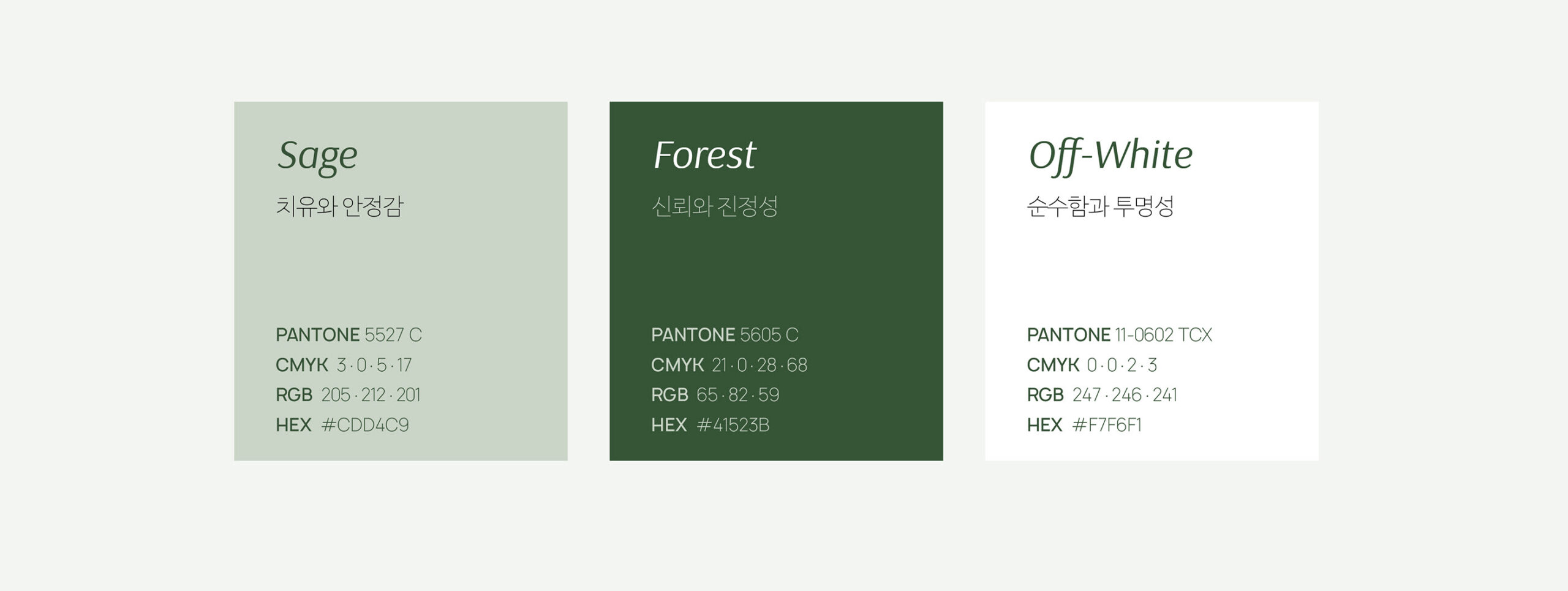
피토버는 식물 유래 성분을 바탕으로 피부 고민을 돌보는 피토테라피 스킨케어 브랜드입니다. 제품이 쌓아 온 신뢰에 비해 기존의 브랜드 표현은 식물 이미지와 화이트·그린 컬러에 머물러, 피부 과학과 자연의 힘을 함께 전하기에는 한계가 있었습니다. BRIK은 브랜드의 철학을 다시 정의하고, 이를 패키지와 다양한 접점에 일관되게 적용할 기준을 마련하고자 했습니다.
Phytover is a phytotherapy skincare brand that uses plant-derived ingredients to care for troubled skin. Although its products had earned trust, the brand’s visual expression remained centered on botanical imagery and a white-and-green palette, limiting its ability to convey both skin science and the power of nature. BRIK set out to redefine the brand’s philosophy and establish a consistent foundation for its packaging and other touchpoints.
Branding Idea
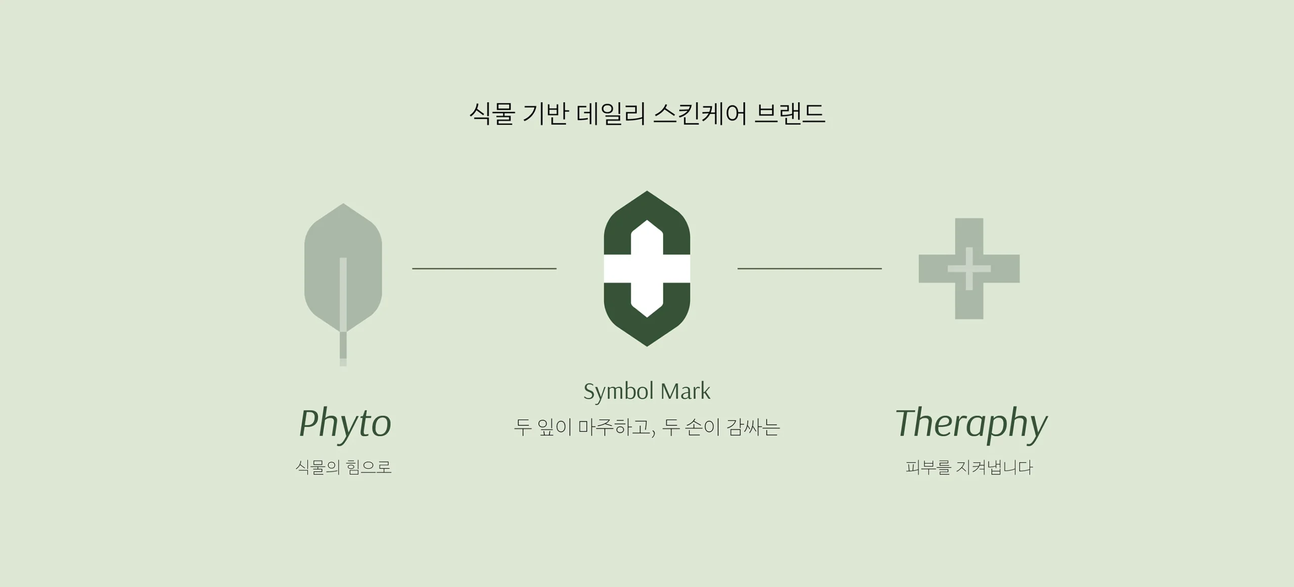
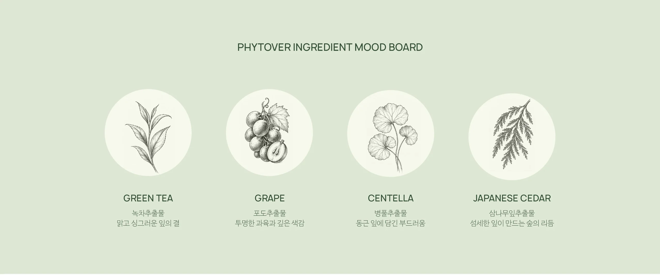
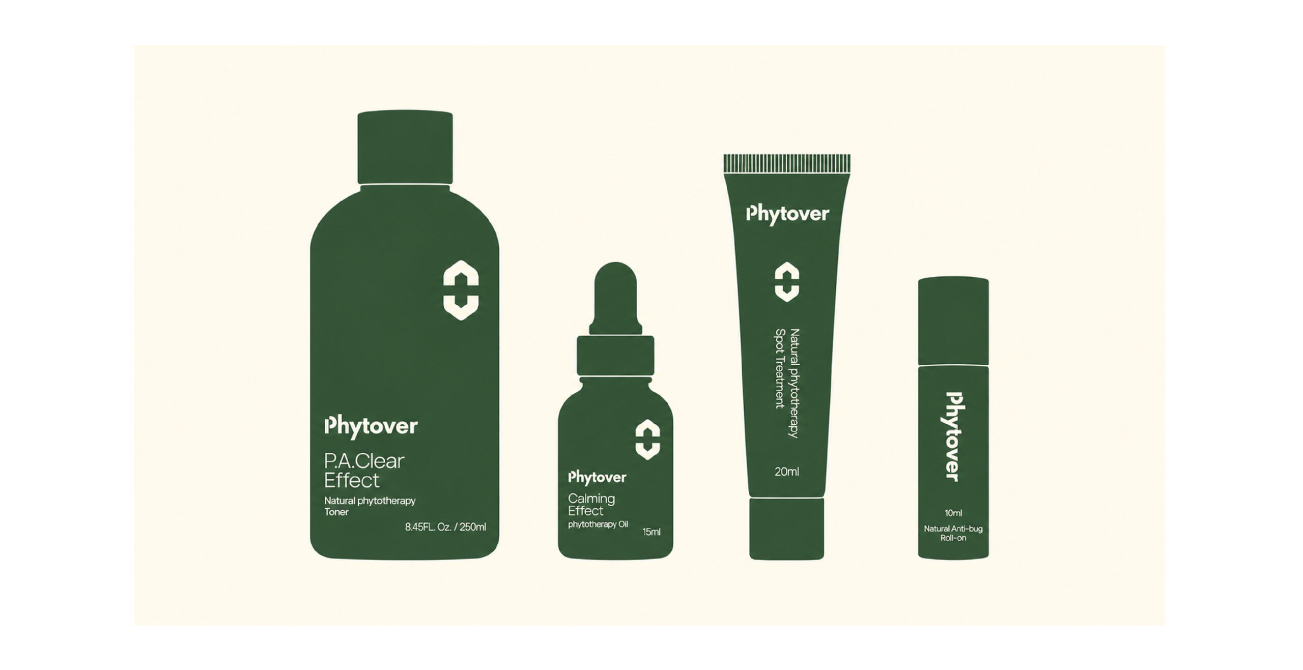
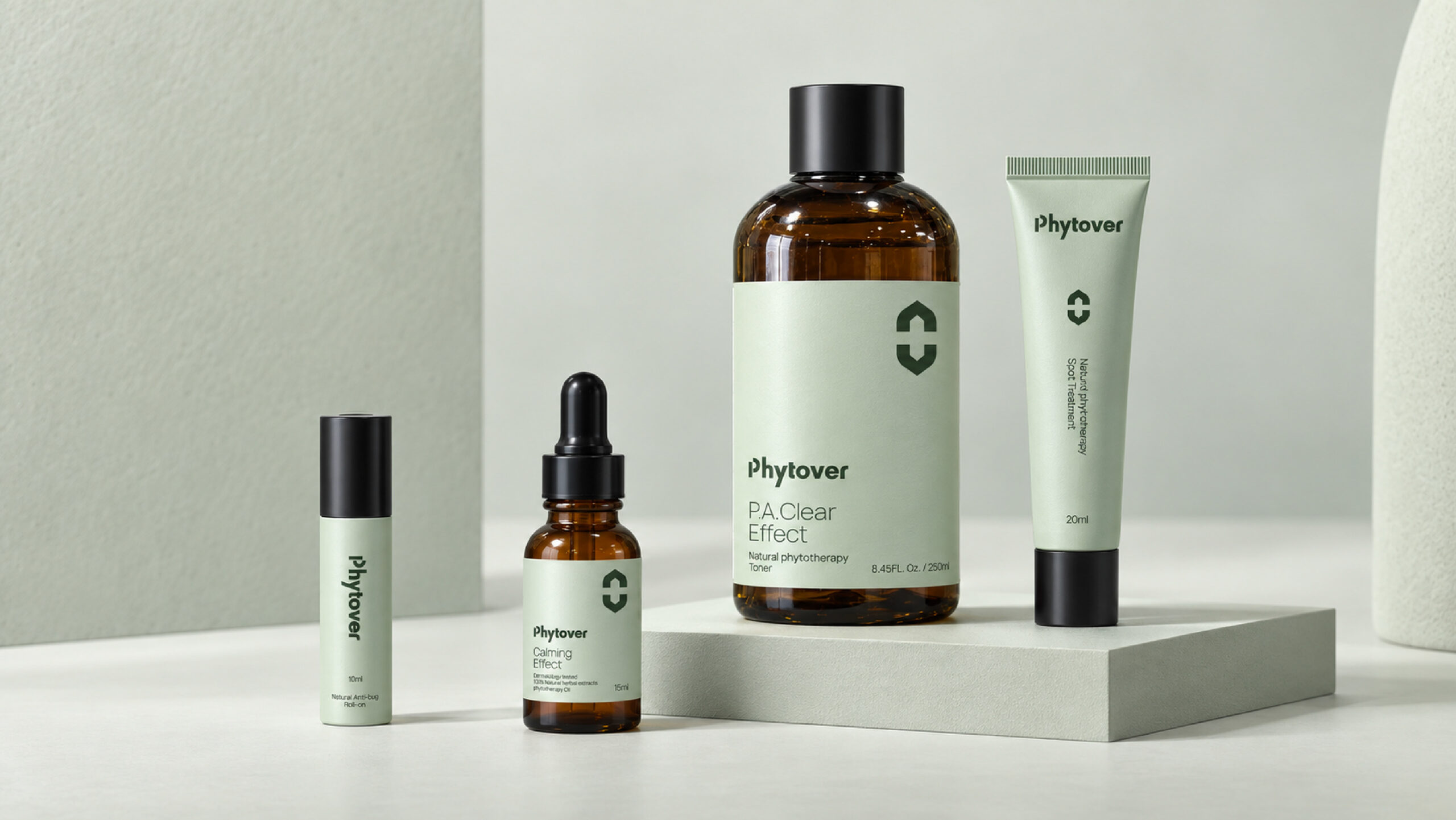
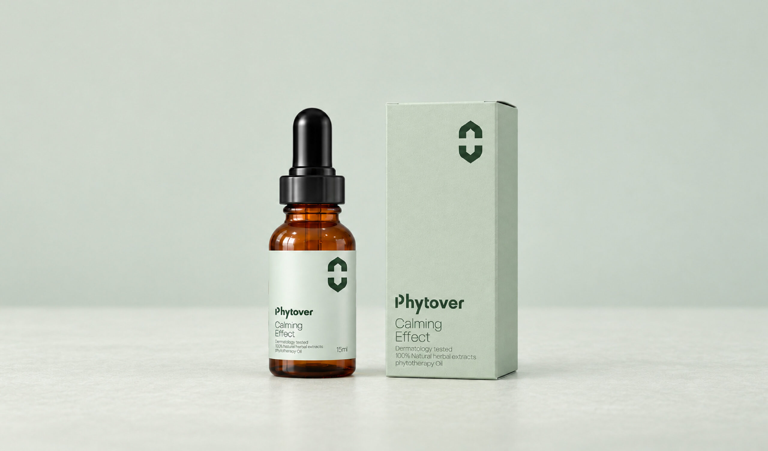
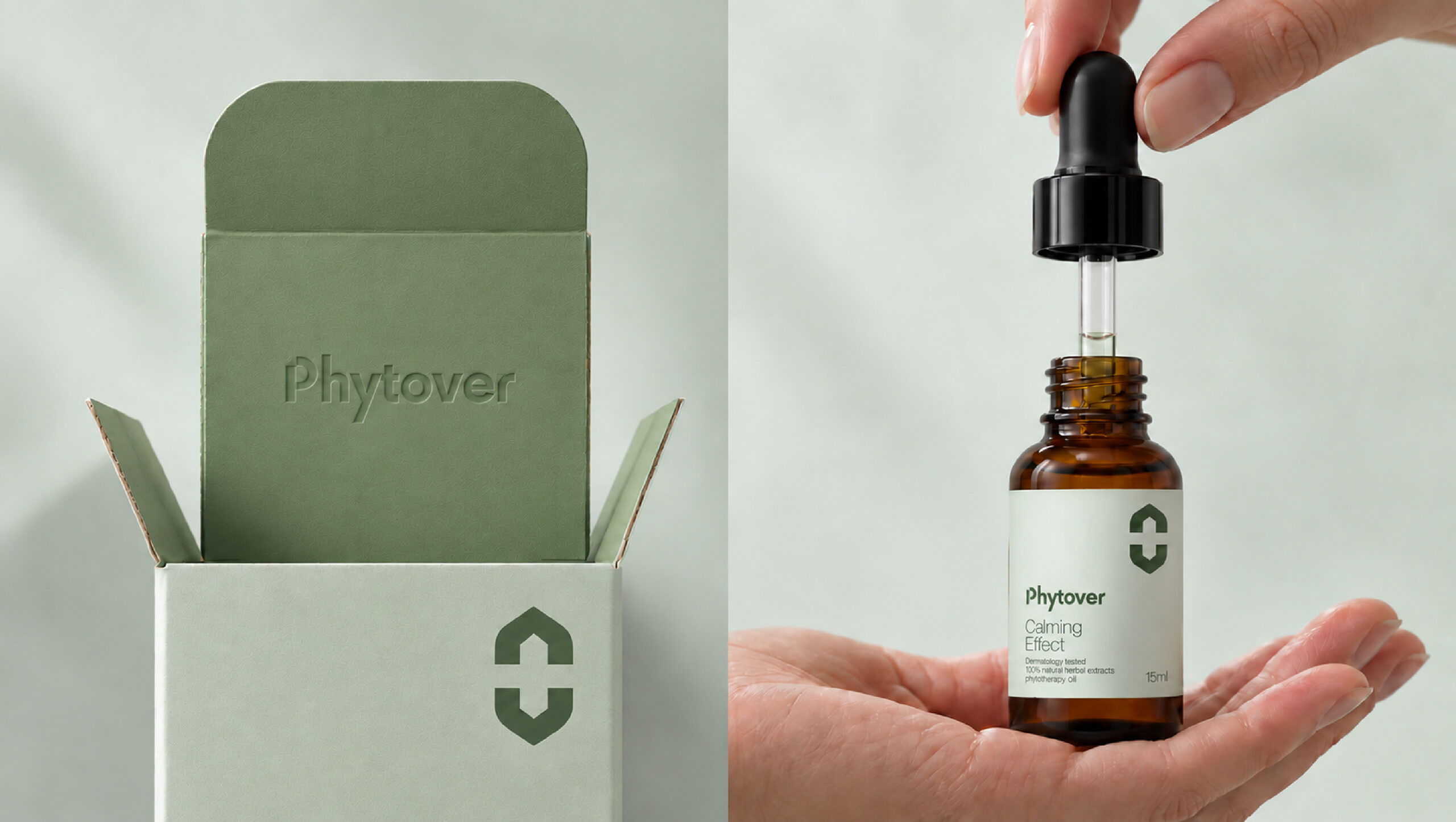
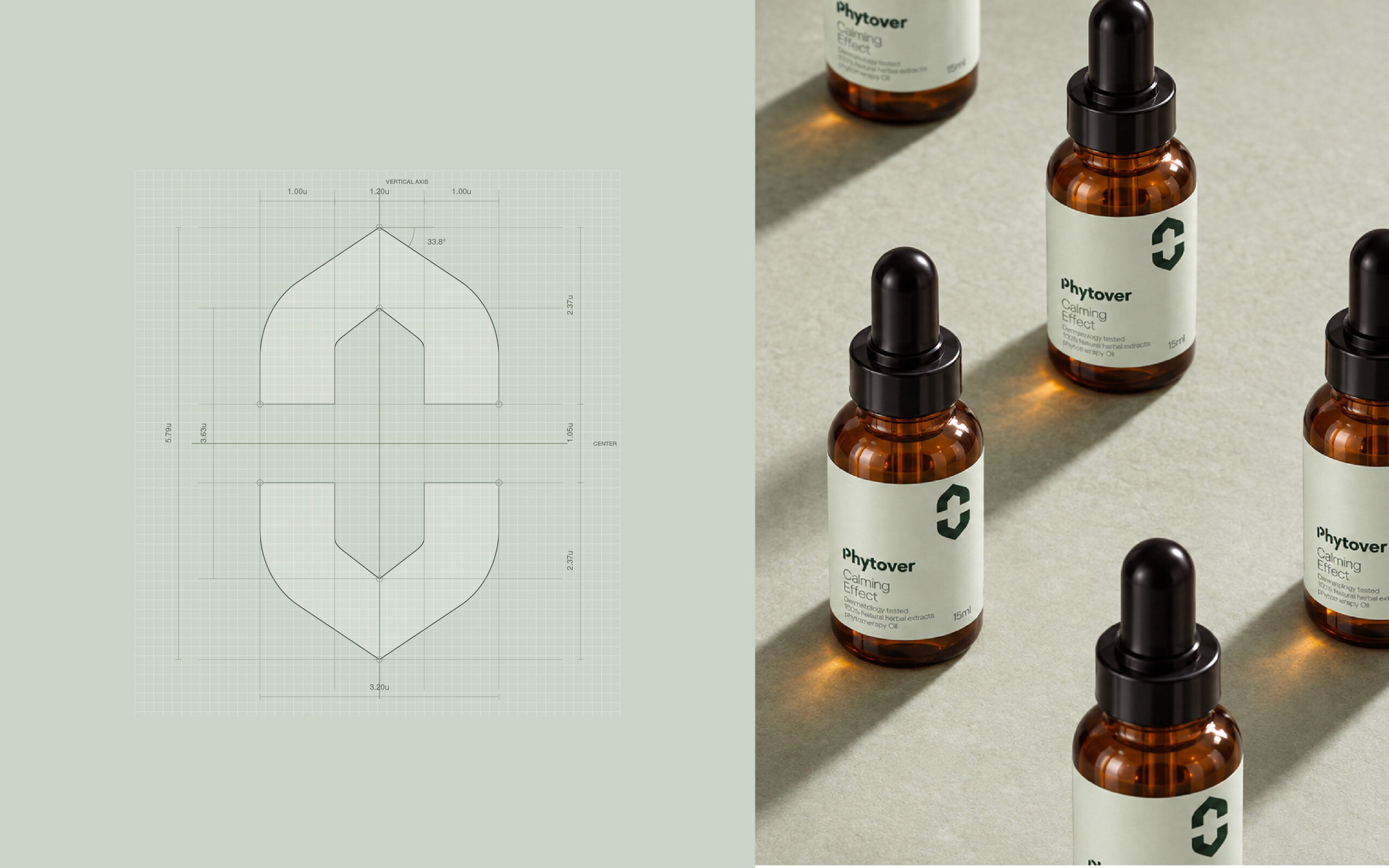
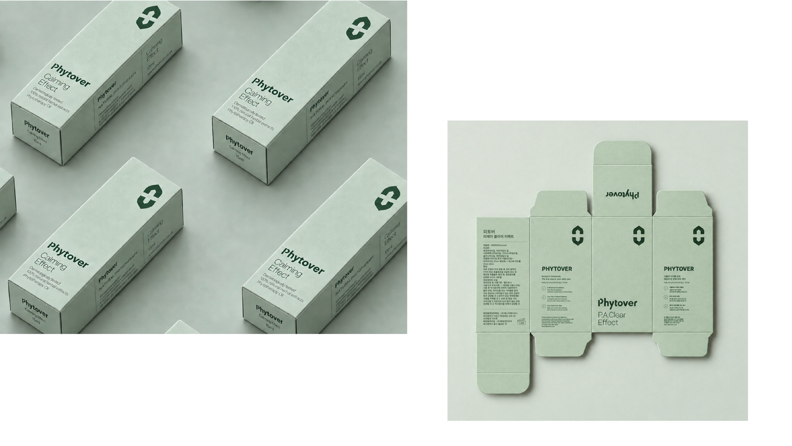
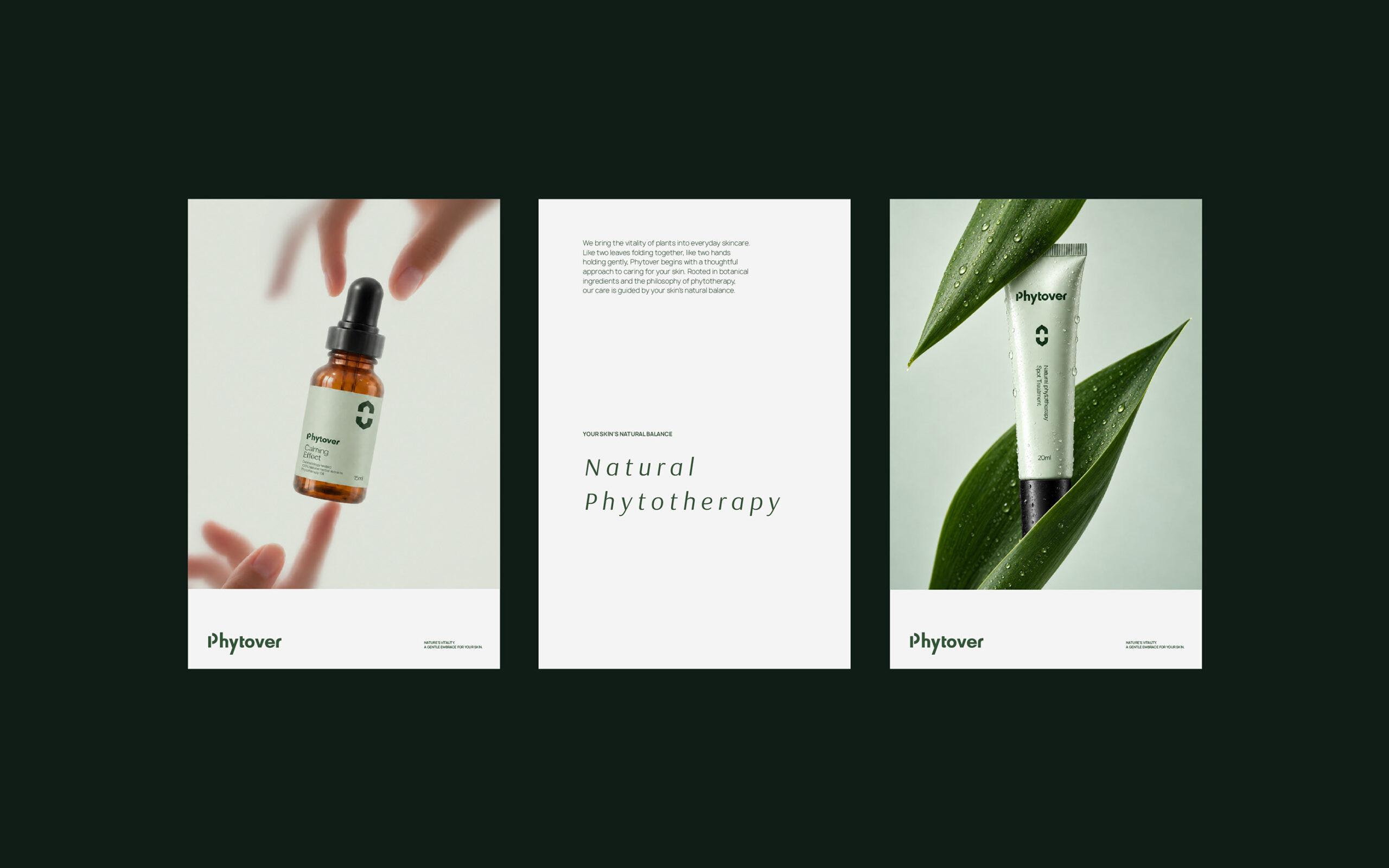
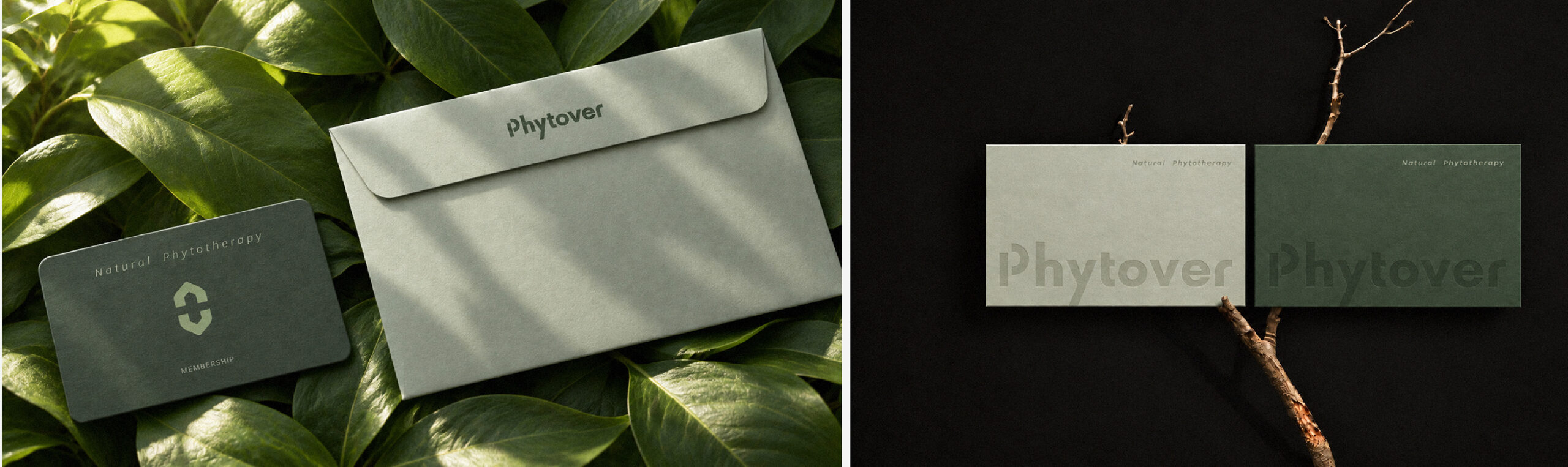
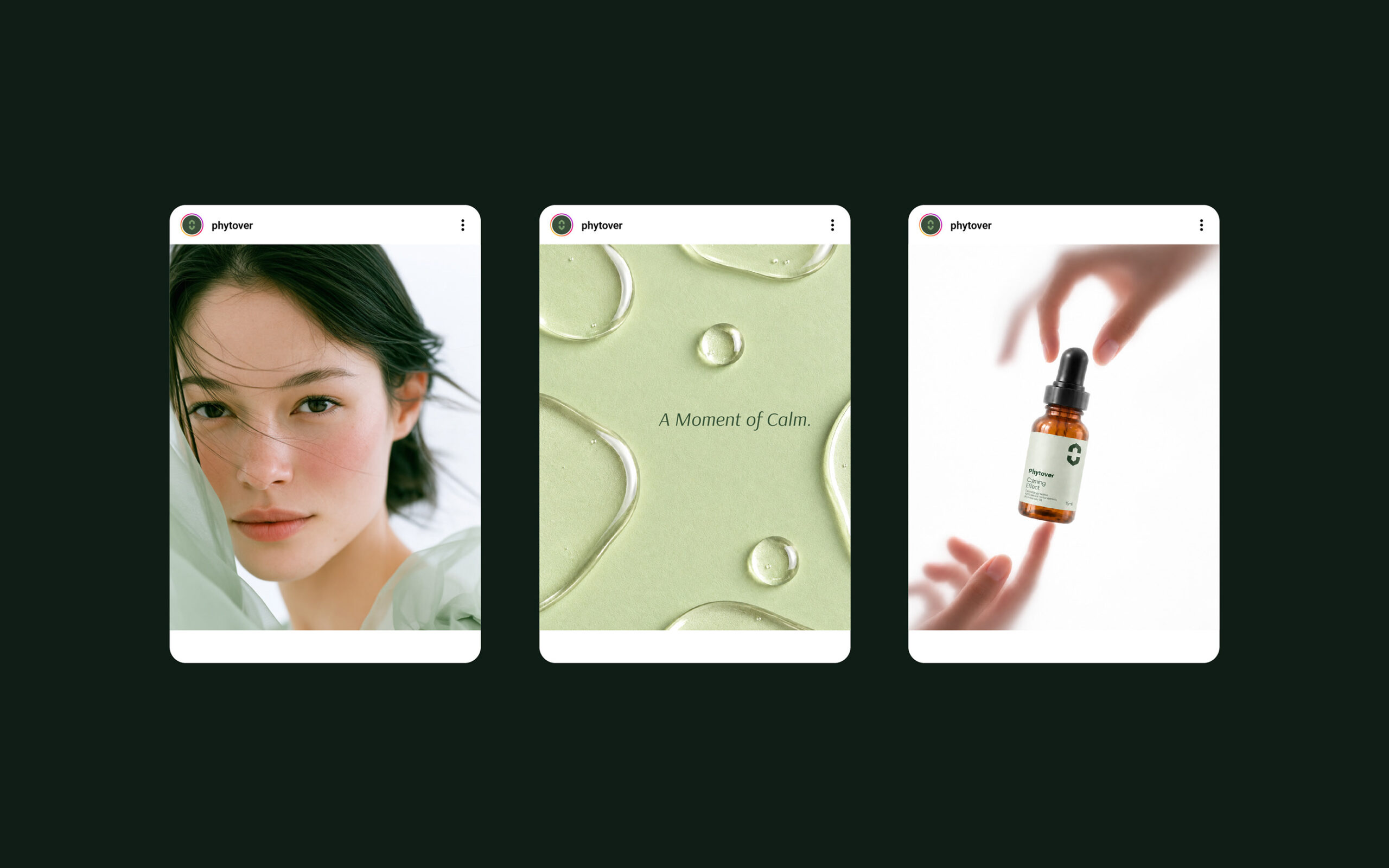
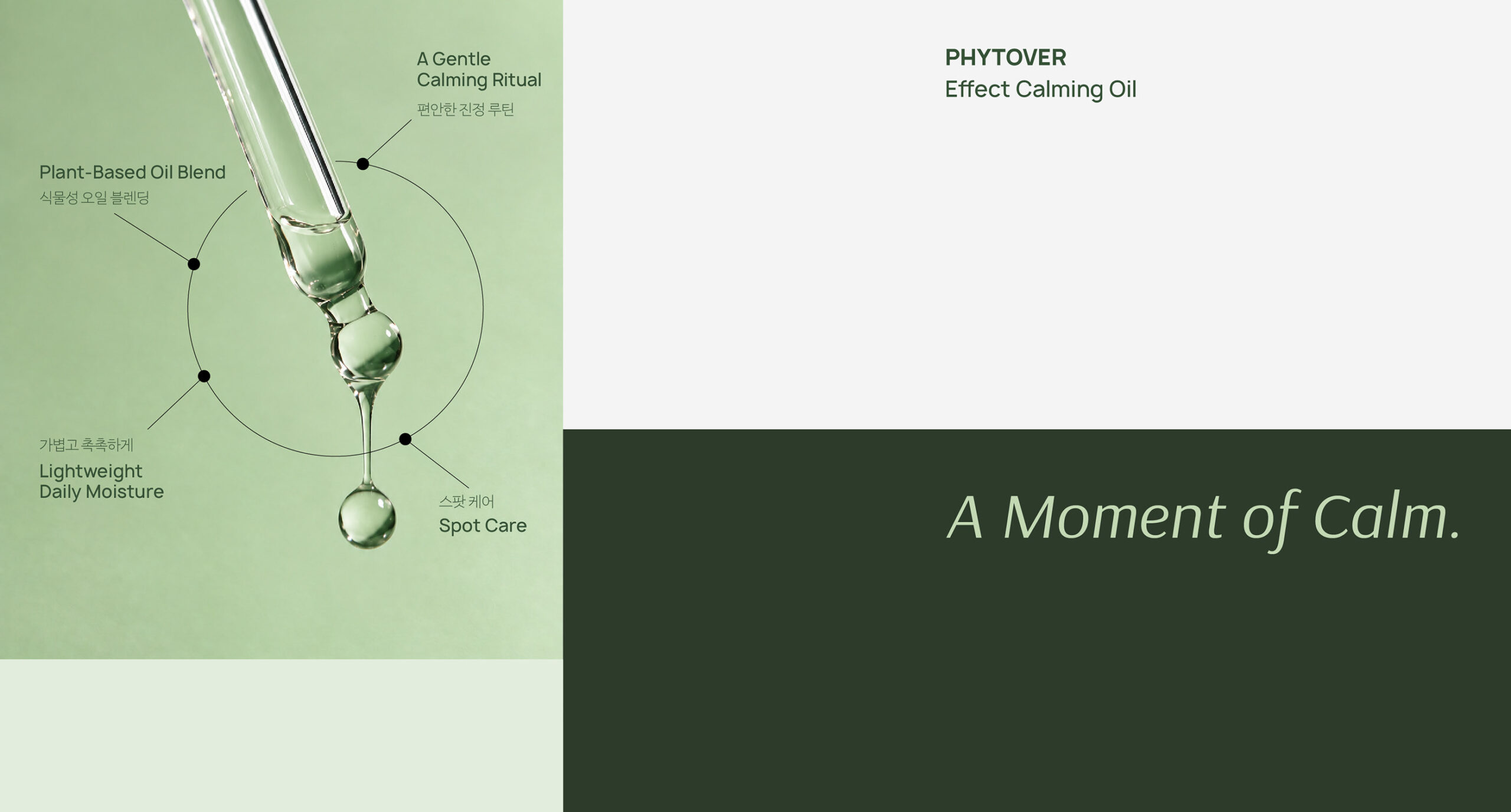
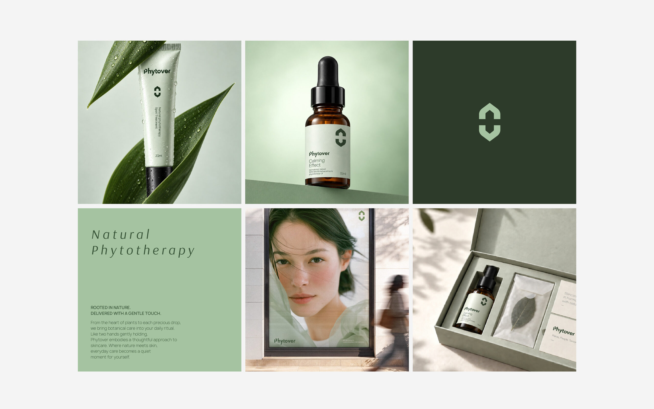
피토버의 이름을 Phyto(식물)와 Over(끝내다)의 결합으로 새롭게 해석해, 피부 고민을 식물의 힘으로 해결한다는 메시지를 세웠습니다. 여기에 Lover(사랑하다)로 이어지는 확장된 의미를 더해, 피부의 회복을 넘어 건강한 삶을 돌보는 브랜드의 지향점을 담았습니다. 식물의 생명력과 피부 과학의 신뢰감을 하나의 시각 언어로 엮어 제품과 패키지 전반에 펼쳤습니다.
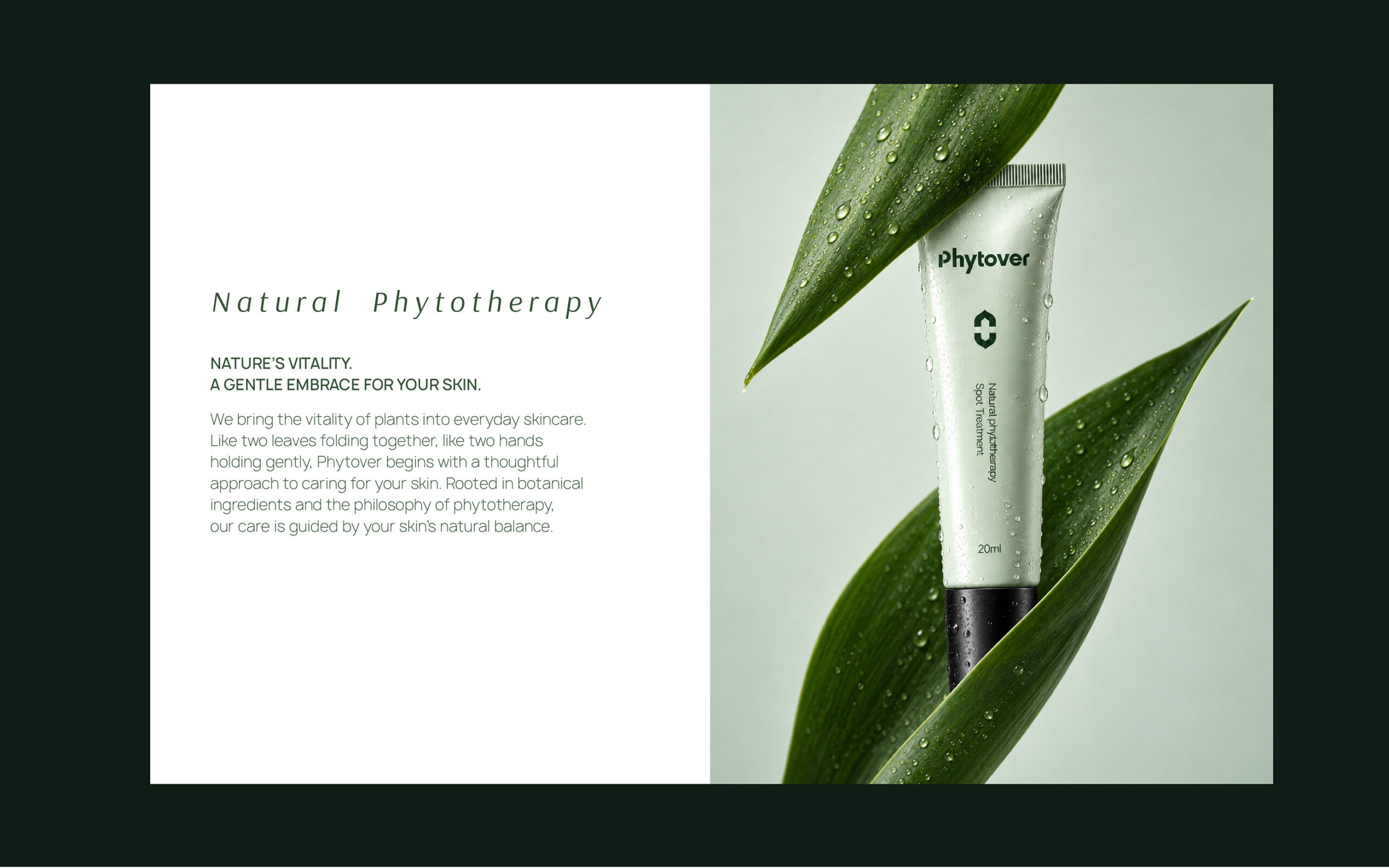
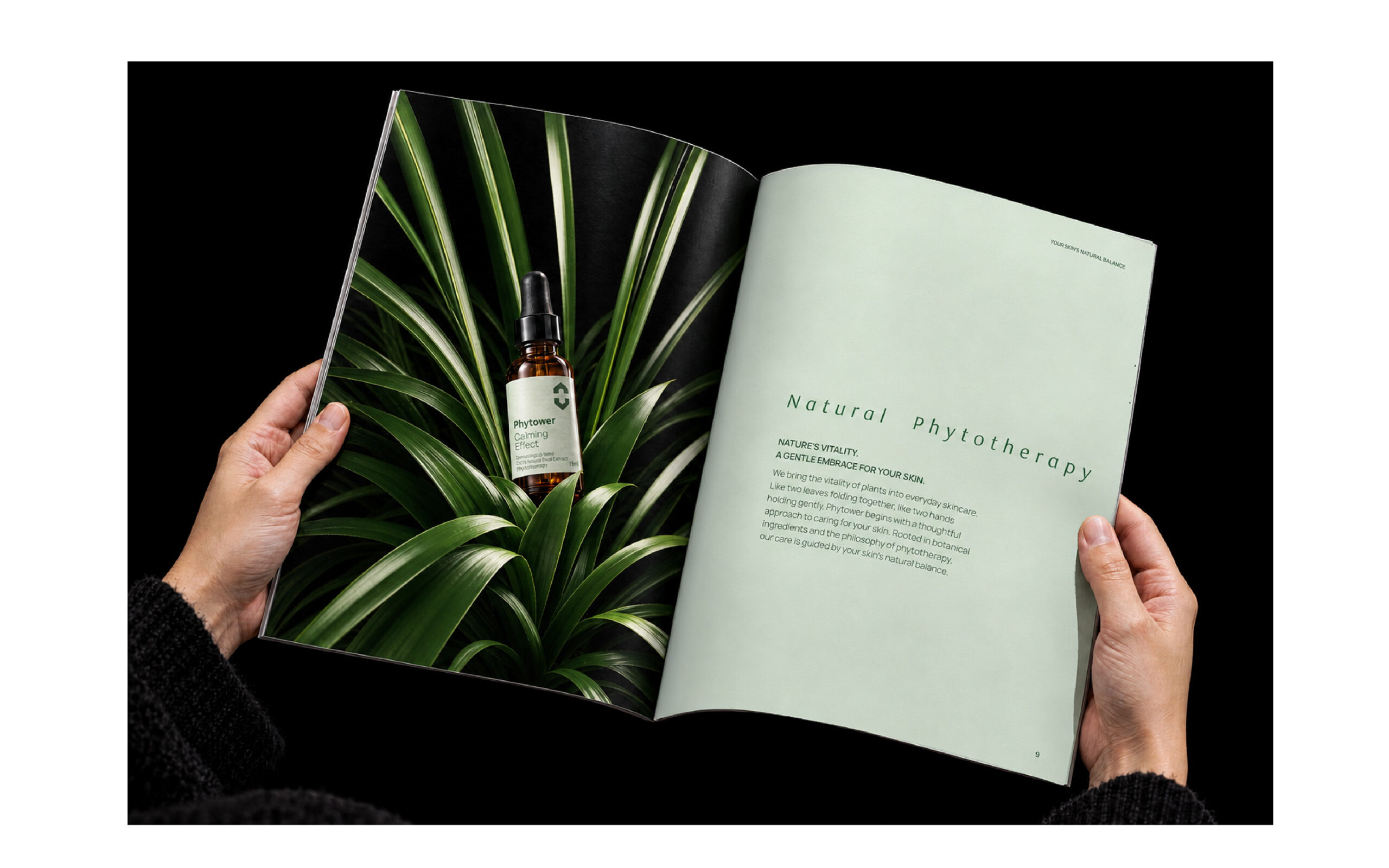
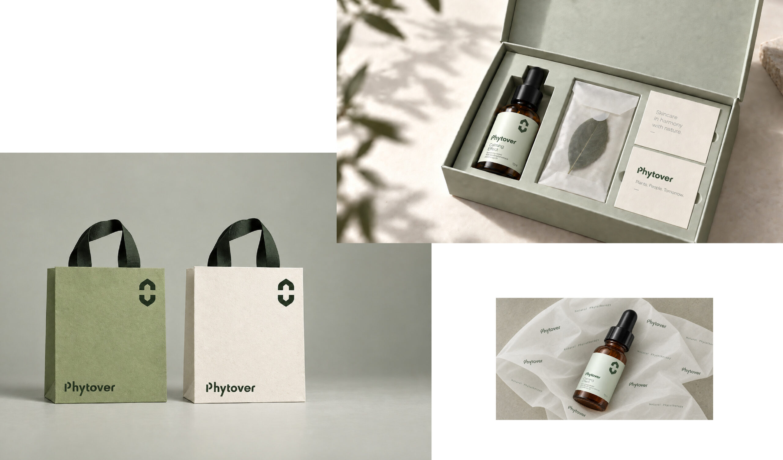
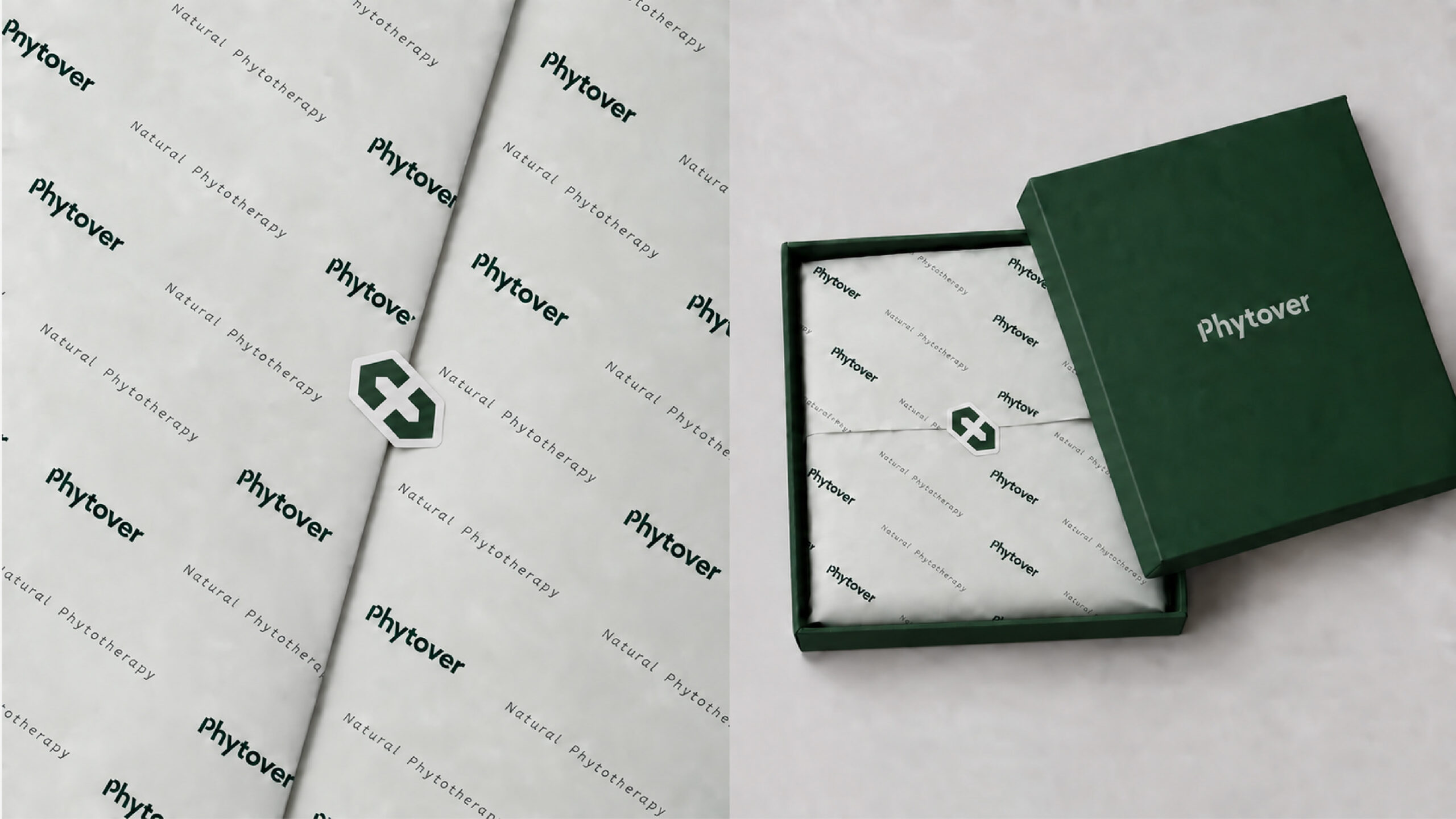
We reinterpreted Phytover as a combination of Phyto (plant) and Over (to bring to an end), giving the brand a clear message about addressing skin concerns through the power of plants. Extending the name toward Lover (to love) added a broader ambition: caring for a healthy life beyond skin recovery. We brought the vitality of plants and the credibility of skin science together in a visual language applied across the products and packaging.



Client
(주) 에스지비즈넷
Project Scope
Brand Strategy: Hyunsoo Woo
Brand Design: Hyunsoo Woo